Case Study · Consumer Mobile · Hero MotoCorp · 2022–23
Hero ICE — Connected Mobility App
A consumer companion app for Hero MotoCorp's two-wheeler riders — service, loyalty, and connected-vehicle data in one experience. Built to work whether the rider's bike was connected or not.
The fast read
- Consumer companion app for Hero MotoCorp — the world's largest two-wheeler maker by volume.
- Designed to work for both connected and non-connected vehicles. Most riders are still on non-connected bikes; the app couldn't ignore them.
- Three pillars: Vehicle Service (records, pick & drop), Goodlife loyalty (Pro / Silver / Gold tiers, vouchers, insurance), and Community (Xclan, trips, events).
- Multilingual from day one — 8 languages, matched to the HMCL website's existing language set.
- Designed for how Indian families actually buy a two-wheeler — not how a single named "user" is supposed to.
Context
The relationship that ended at the showroom
Hero MotoCorp sells more two-wheelers per year than anyone in the world. For decades, the customer relationship effectively ended the day the bike rolled off the dealership floor — service was a phone call to a workshop, loyalty was a paper voucher book, and the brand had no direct digital line to the rider.
New connected models — Xtreme, Pleasure+ XTEC, Xoom — were introducing telematics. The opportunity was obvious: build a companion app. The harder question was who it was for. The connected fleet was a fraction of the installed base. If the app only worked for connected bikes, Hero would be designing for the minority and alienating millions of existing riders.
The problem
Three audiences, one screen of real estate
For the connected rider
"I want to see what my bike is doing — odometer, fuel, last ride, battery — and I want service and rewards in the same place I check on the bike. Don't make me jump between apps."
For the non-connected rider
"I bought a Hero bike. I should get the same relationship, the same loyalty points, the same easy service booking — even if my bike isn't a smart bike. Don't make me feel like a second-class customer."
For Hero MotoCorp
"We want a direct consumer channel — service, loyalty, community, all in one. We want the relationship to outlive the dealer transaction. And we want one app, not three."
My role
Design Manager — team, client, journey
Led the project team at YUJ — research, IA, visual design, and final shipped screens — and owned client interactions with Hero MotoCorp. The team executed the screens; my work was the spine: setting the design principles, running client reviews, defending the harder trade-offs, and keeping the connected and non-connected experiences coherent inside one app.
Research was a team effort — field conversations with riders, dealers, and service-centre staff fed the design directly. The "food for thought" insight that anchored the whole product came out of that research, not the brief.
Approach
Design for the larger audience first
The naive approach would have been to design the connected experience first — it's the shinier one — and bolt on a degraded version for non-connected riders. That gets the brand a glossy demo and a poor experience for most of its customers.
We flipped it. The non-connected state was the baseline experience; the connected state was an additive layer of live data on top. Same screens, same loyalty, same service flow — connected riders got more numbers populated, non-connected riders got the same relationship.
Three pillars carried the value: service (the real pain), loyalty (the relationship), and community (the brand). Telematics was the fourth thing, not the first.
Key decisions
Four trade-offs that shaped the product
Decision 01
Non-connected as the baseline, not the fallback
Designing the connected state first would have produced a glossy demo and a degraded experience for the majority. We landed on the non-connected experience as the baseline — same screens, same value, same loyalty — and treated connected data as an additive layer. The team built the components to render with or without live telematics, so the rest of the product never had to special-case it.
Decision 02
Designed for the family, not the named user
Field research surfaced the cultural truth: in India, the family buys the bike, not the individual. Word of mouth, festive cycles, financing decisions — all family-mediated. We re-weighted the IA around the moments where family enters: choosing a service plan, redeeming Goodlife rewards, sharing trip records. The "single user with a wallet" model from typical fintech apps would have missed half the audience.
Decision 03
Service flow built around pick & drop, not the workshop visit
The default mental model in two-wheeler service is go to the workshop. For most urban customers in 2022, that was the worst part of ownership. We landed on a service flow led by Vehicle pick & drop — the workshop comes to you — with the workshop visit as a secondary path. Job card, payment, and SR number all expand inline; the customer never leaves the screen.
Decision 04
Goodlife as a tier ladder, not a flat points wallet
The earlier Goodlife was a flat loyalty programme — points in, vouchers out. We restructured it as three explicit tiers — Pro, Silver, Gold — with named benefits at each level (insurance, shopping vouchers, welcome bonus). The ladder gave riders a reason to engage past the first service cycle, and gave Hero HQ a clear lever for retention campaigns.
01 / 04
Selected artifacts
The actual screens
Four artefacts from the project. Real shipped designs from the deck the team presented to Hero MotoCorp.
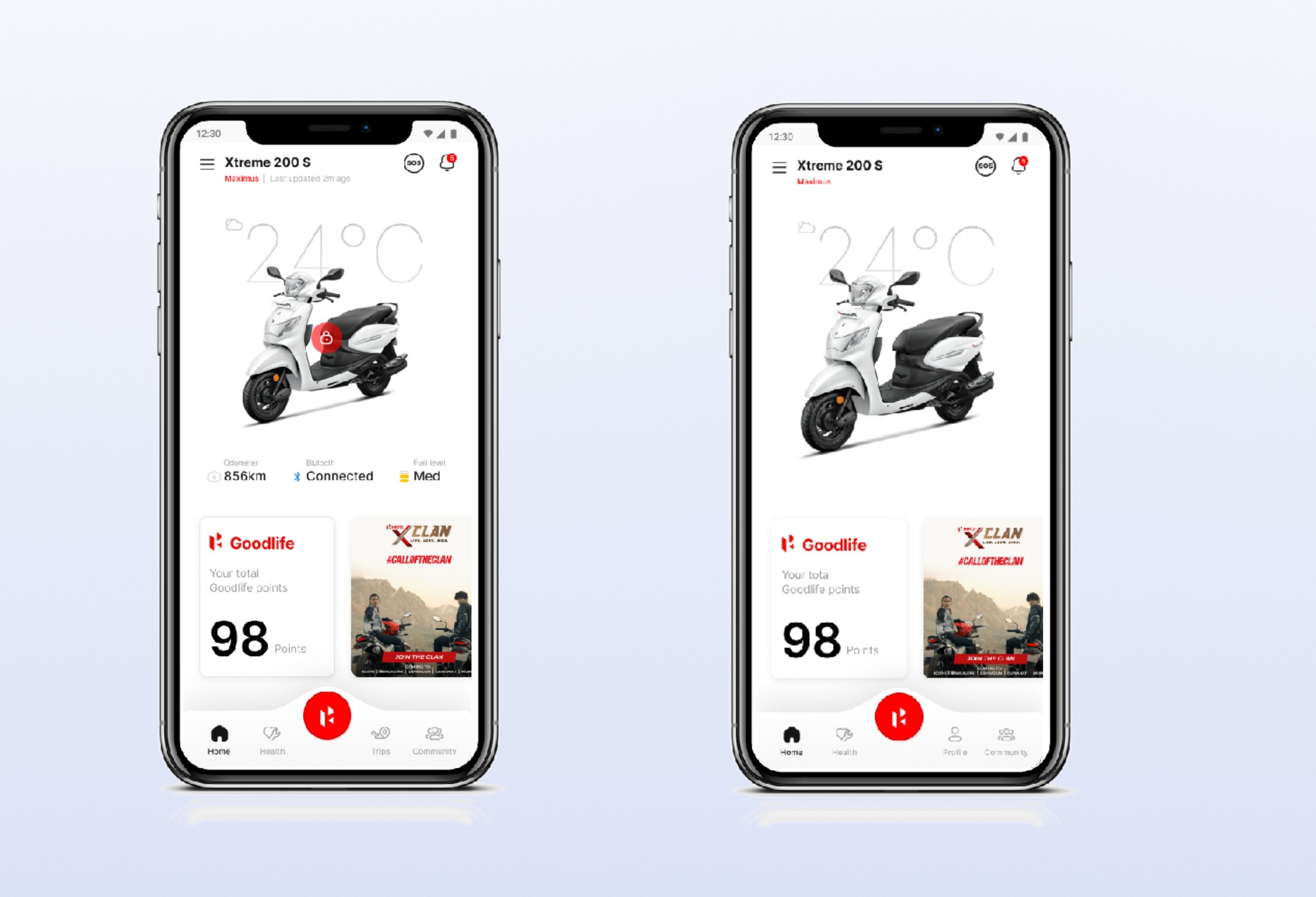
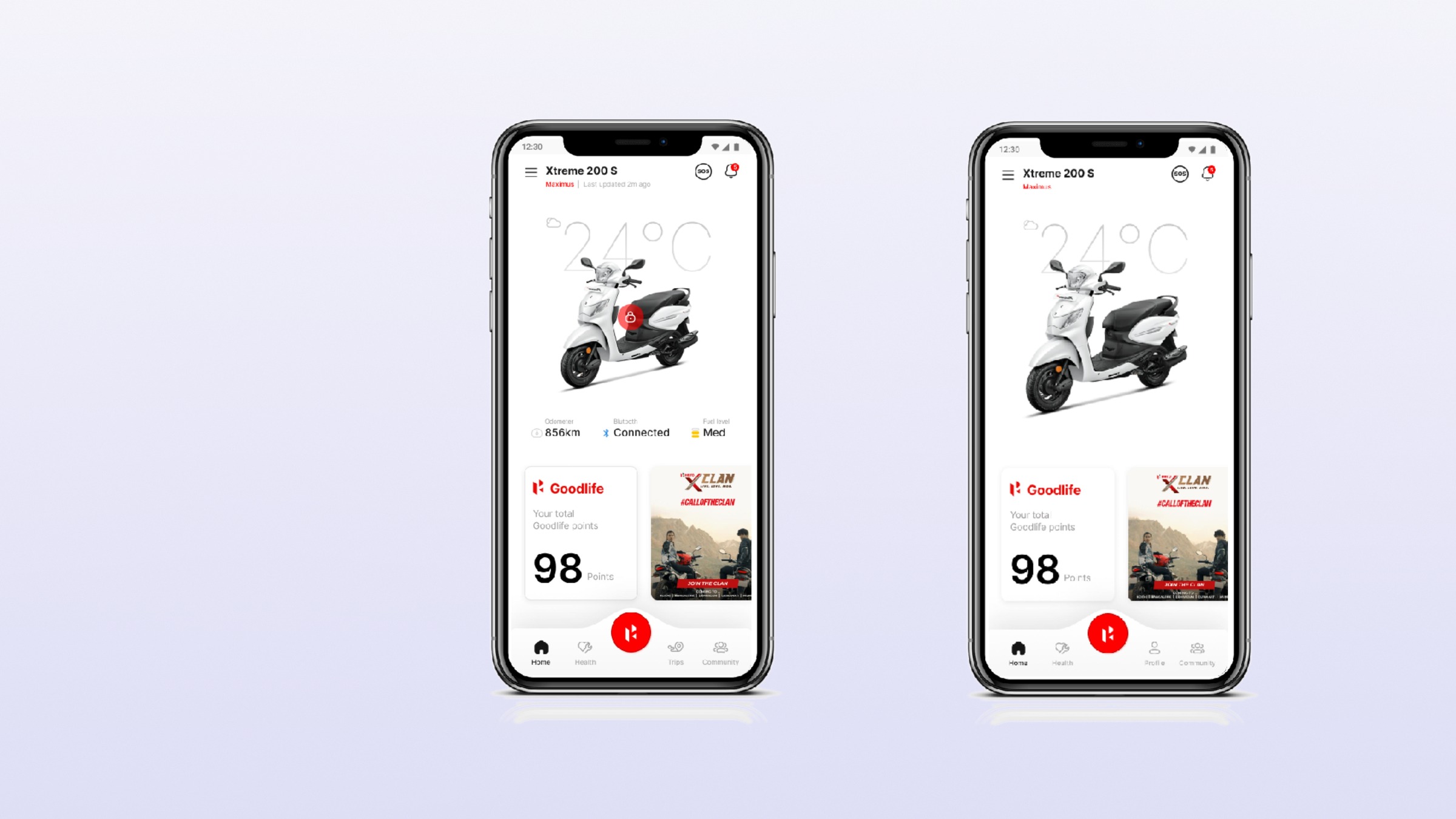
Figure 1 · Connected + non-connected states
The home screen in two states: connected on the left (live odometer 856 km, Bluetooth connected, fuel level), non-connected on the right (telematics fields greyed out, everything else identical). Goodlife points, Xclan community, navigation — same for both. Same relationship, different amount of live data.
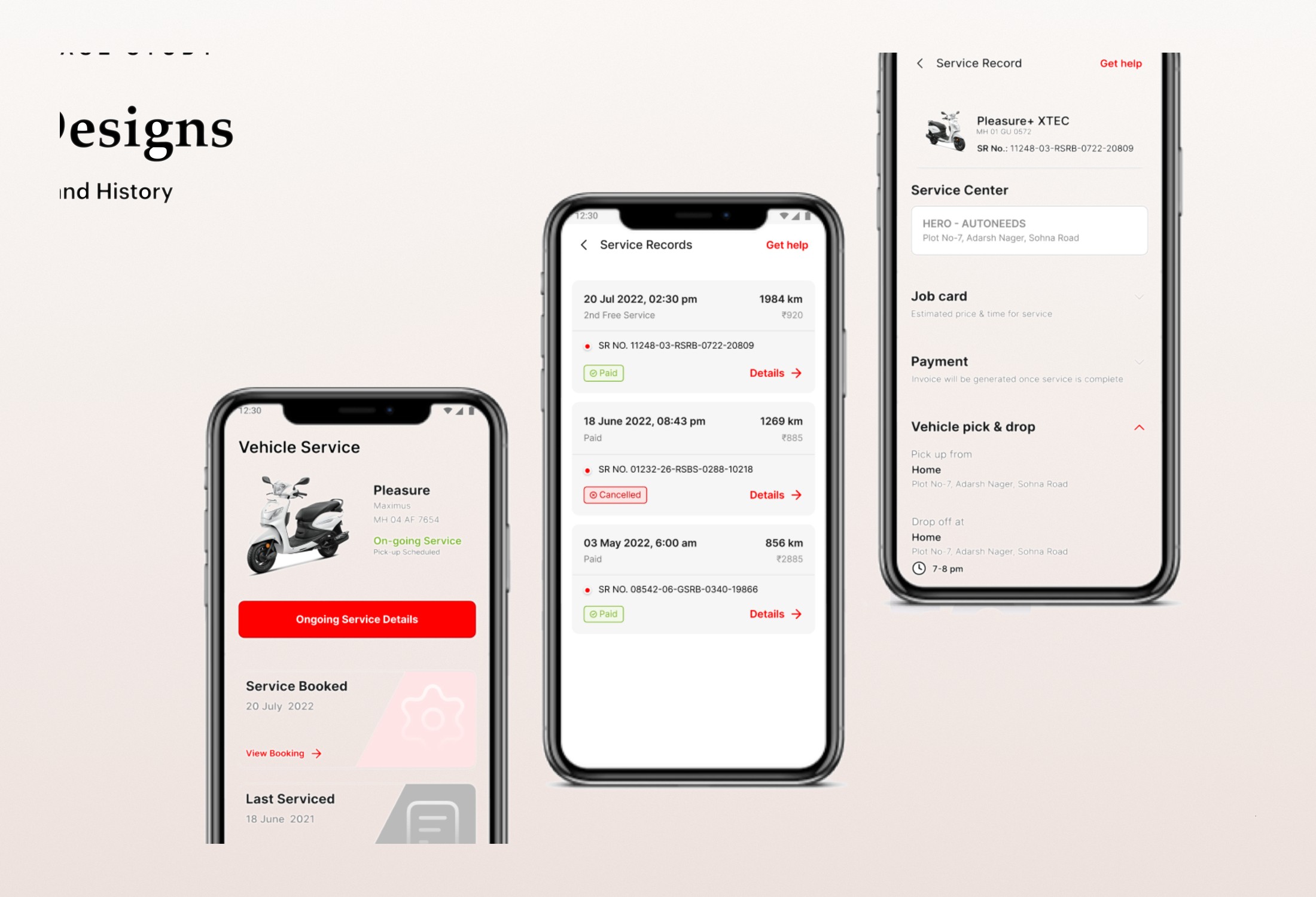
Figure 2 · Service Records and Vehicle pick & drop
The full service flow. Left: the rider's current Vehicle Service status — on-going service, pickup scheduled. Middle: Service Records list with paid, cancelled, and historical entries (each with SR number, kilometres, and amount). Right: Service Record detail — Job card, Payment, and Vehicle pick & drop expanded inline with pickup and drop-off addresses and a service window.
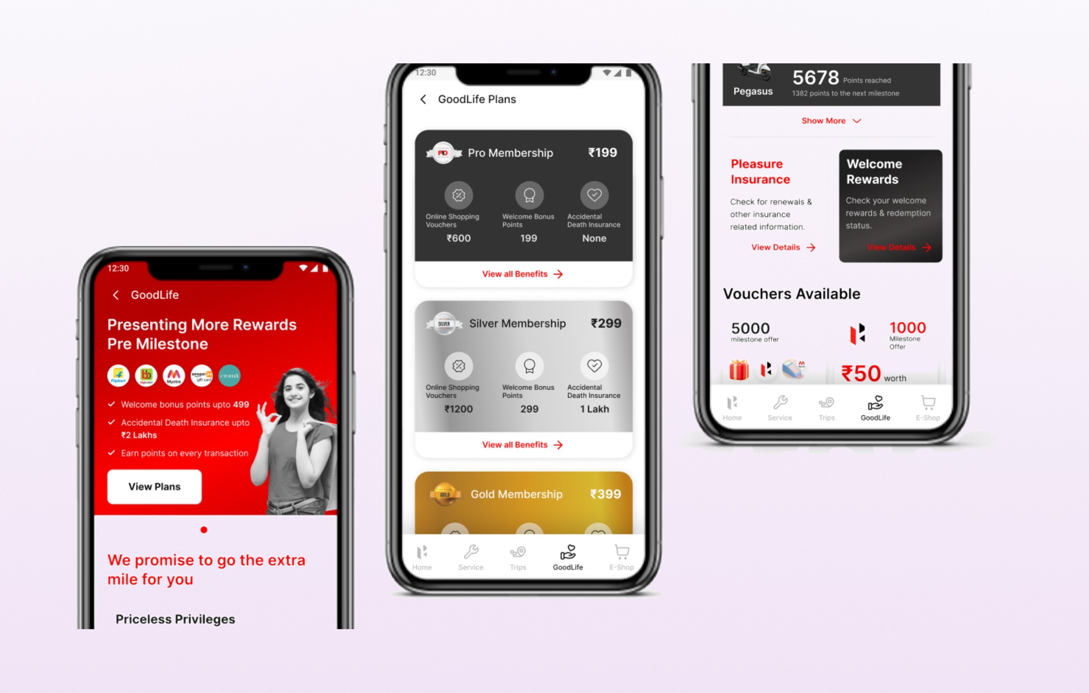
Figure 3 · Goodlife Program — tiers and vouchers
The Goodlife loyalty ladder. Left: the Goodlife landing — "Presenting More Rewards" with welcome bonuses, insurance, and per-transaction points. Middle: the three tiers — Pro ₹199, Silver ₹299, Gold ₹399 — with named benefits per tier (shopping vouchers, welcome points, accidental death insurance up to ₹2 lakhs at Silver). Right: a rider's Pro Membership status — Pegasus tier, 5,678 points, vouchers, and insurance modules.
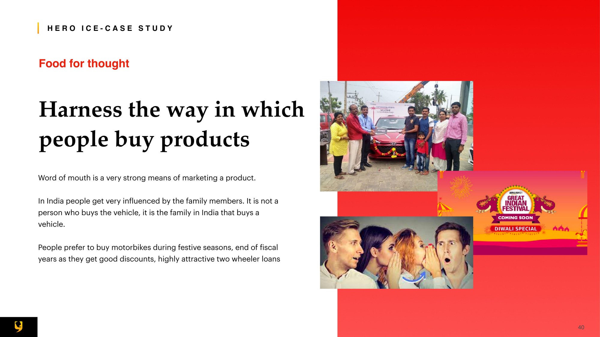
Figure 4 · The insight that anchored the product
The single research finding that re-weighted the whole IA: in India, the family buys the vehicle, not the individual. Word of mouth, festive cycles, and family financing decisions are the real spine of two-wheeler purchase behaviour. Every subsequent design decision — multilingual support, Goodlife structure, shared service records — traced back to this slide.
Outcome
Shipped, and the spine for what came after
- Final designs shipped to Hero MotoCorp engineering for build.
- Became the visual and IA foundation for Hero's consumer connected-mobility experience.
- The non-connected-first design principle held — the app didn't degrade for the majority of riders.
- Goodlife tier ladder gave Hero HQ a structural retention lever that the flat points programme didn't have.
Specific download and retention numbers belong to Hero MotoCorp — available in interview conversations under NDA.
Reflection
"The hardest design moves in consumer mobile are the invisible ones — designing for the audience that doesn't have the shiny feature, designing for the family instead of the named user, designing the baseline so well that the additive layer feels like a gift rather than the whole product."
Hero ICE was the project that taught me to distrust the brief's named user. The brief said connected rider; the research said family. The brief said telematics; the customers said service and rewards. The job of a Design Manager is to surface that gap inside the client relationship — politely, with research in hand — and then redesign the product around the truth. That's where the real value lives.